How AI is killing UX (for now)

Generative AI is impressive, but it’s making our apps less useful right now.
There’s an age old balancing act in the technology world. On the one side of the scales, there’s the technologists, the scientists, the engineers. They’re creating new technology which gives humans more capability. They push us forward.
But they can’t do it without the other side – the user researchers, the designers, the product managers and product marketers. On this side of the scales, there's use-cases and user needs and anchoring and framing. Taking the thing the technologists make and translating those things into things humans can actually use.
The introduction of the iPhone in 2007 was a moment where the scales were perfectly balanced. It was where technologists had packed networking and multitouch and software and hardware engineering into a 3.5 inch hand-held device.
But it’s also where modern user experience design was born. This launch eschewed so much conventional wisdom – principally that humans had to bend themselves to the will of their computer to get anything done (remember using Windows 95?) – and turned it on its head. Suddenly, all you needed to do was tap on an icon or press the button on the bottom to go back.
Over the following years, the modern disciplines of product management, product design and product marketing were born. As engineers innovated, designers researched customer needs and created user experiences and flows that made the technical capabilities sing. Product managers learned how to balance customer needs with business objectives. And product marketers got deep into the market and customer needs and created compelling reasons to use the things the designers designed and the engineers built.
This has been the recipe for the last fifteen years in technology products – and generally speaking the products that have been successful are the ones that are the most user-friendly: the ones that feel good in the hand. This was always a driving force behind the products I worked on at Monzo. We always asked ourselves whether it felt nice in the hand. Because trust and affinity are things that are felt, not seen.
But as we enter a new era in technology – the AI era – the scales have tipped, for now, towards the technologists and away from the designers. Products are feeling worse in the hand. Some services are even taking a step back. At least for now.
Let’s talk today about the balance between getting new technologies out there and being truly thoughtful about how they’ll be useful.
ChatGPT popularised AI
I very vividly remember when an early version of ChatGPT was made available to the public for the first time in late 2022. The first time I heard about it, I was on a train with very little signal on an early December morning. Still, I had to try and pull it up on a 3G connection to play with it. I couldn’t miss out.
It wasn’t supposed to become a household name: it was just an experimental tool to show off OpenAI’s GPT 3 model. But it’d gone viral quickly as it was impressive, even in its slightly janky design.
It was at that perfect inflection point, I think, where the technology had become just good enough, and the form factor this technology was squeezed into was familiar enough for a critical mass of folks to adopt it.
Fast forward to today and ChatGPT is a brand name. It’s the Hoover or Post-it of AI. But that’s not only the lasting impression ChatGPT has had on the world so far.
Its form factor has taken off too. Apps everywhere are adding ChatGPT-like functionality. Large Language Models (or LLMs) are experiencing a boon in popularity, almost at the expense of other types of AI, because ChatGPT exploded so vigorously. This means that text boxes and chat boxes and walls of text are invading everyday apps.
Yes, the technology is impressive, but I think we’re at risk of losing good user experience design in favour of long, winding blocks of text that don’t actually help us get anything done quicker.
And something about Google’s Made By Google event last week tipped this over the edge for me, I think.
Replacing good design with mediocre text
I saw this thread today 👇
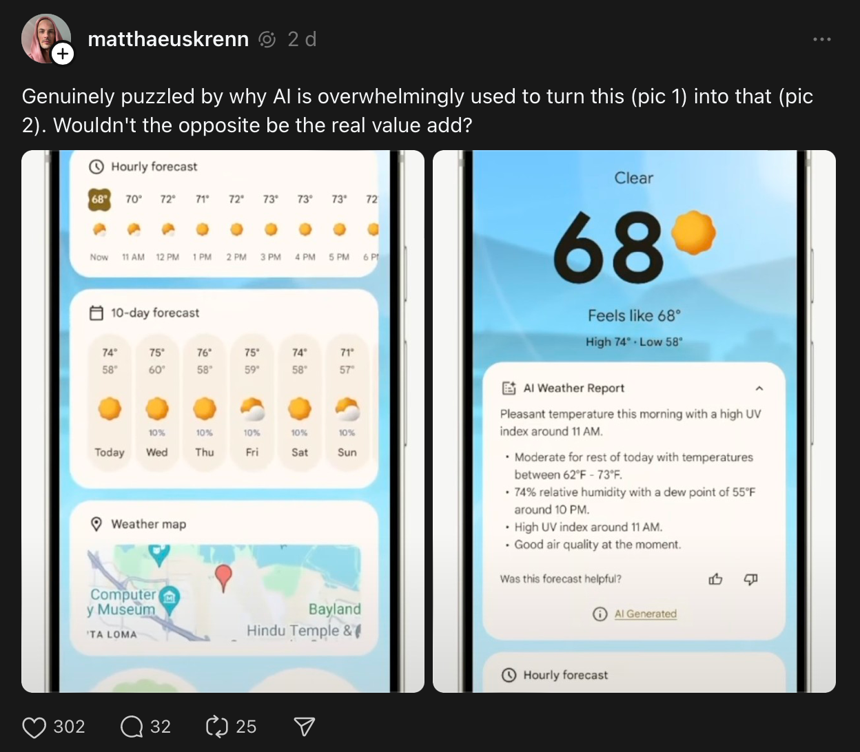
And I think it’s a perfect snapshot of what I’m getting at on the technologist <> designer scale. In this picture, Google has prioritised technology over user experience design. Clearly, it’s better to show more visuals here. The phone screen is capable of showing bright colours, graphs and charts you can poke and play with, animations that help you understand the information on display.
Yet, in this instance, Google has deprioritised a good user experience for… a language model that can accurately describe the weather in plain text? This is a big step back.
Yes, it’s very impressive that a computer can seem like it’s understanding live weather data and talking to you about it, but does it help the user understand what’s happening at a glance, more than the first design? No. It’s clearly worse.
Google, and other companies that are adding AI everywhere, will tell you that it’s early and that they need to add these experiences now so the AI can train and improve over time. So the argument goes: let’s just put it out into the world and get as much training from real users as we can. And over time, the product will improve.
And I’m sympathetic to that argument – but it still means things are bad now. And it means these companies might be getting the wrong data, too: falsely following a text-first AI interaction model because… well, that’s where we started with ChatGPT and didn’t move past. Entrenching a form factor because we started with it, rather than trying new form factors and designs.
I can write you an essay, but I can’t set a timer
AI's also changed tried-and-tested voice assistants, in some cases for worse. Last week, Google announced Gemini Live at Made By Google. Gemini Live is an LLM-based assistant that can connect with your personal data and help you out with situations based on your life (and it costs $20/month).
At the event, an excited Googler showed us (after two failed attempts) that they could snap a picture of a Sabrina Carpenter poster, and then ask Gemini Live if they were free and in the city for any of those days. Gemini’s reply?
Sure, I found that Sabrina Carpenter is coming to San Francisco on November 9, 2024. I don't see any events on your calendar during that time.
Nice.
These are genuinely cool things, and the kind of thing we’ve wanted Siri or Alexa or Google Assistant to do for a really long time. So I’m glad it’s here.
But because Gemini is based entirely in the cloud and is rebuilt from the ground up, there are some things it… just can’t do? Weirdly, these are the things that people use voice assistants for most.
Here’s Joanna Stern at the Wall Street Journal:
When I asked it to set a timer, it said it couldn’t do that — or set an alarm — “yet.” Gemini Live is a big step forward conversationally. But functionally, it’s a step back in some ways. One big reason: Gemini Live works entirely in the cloud, not locally on a device. Google says it’s working on ways for the new assistant to control phone functions and other Google apps.
Surely this is a regression, and it’ll take a lot of unlearning for folks with that muscle memory too. People have been asking voice assistants for timers and the weather and to play Spotify for years. I can't remember the last time I manually started a timer versus asking Siri to do it.
By the looks of this early version of Gemini Live at least, those easy, quick things that it’s easier to ask for verbally, quickly, are gone (here's a big Reddit thread of all that is lost with Gemini Live).
Talking of AI taking actions for you – Rabbit's R1 was an early glimpse at what it might look like for AI to do things for you.
Language versus action
ChatGPT, Meta’s Llama and Google’s Gemini are Large Language models. These are the models that are inspiring a generation of conversational products.
Back in March, the Rabbit R1 was released with a Large Action Model – which is a type of LLM design to – you guessed it – take actions for you.
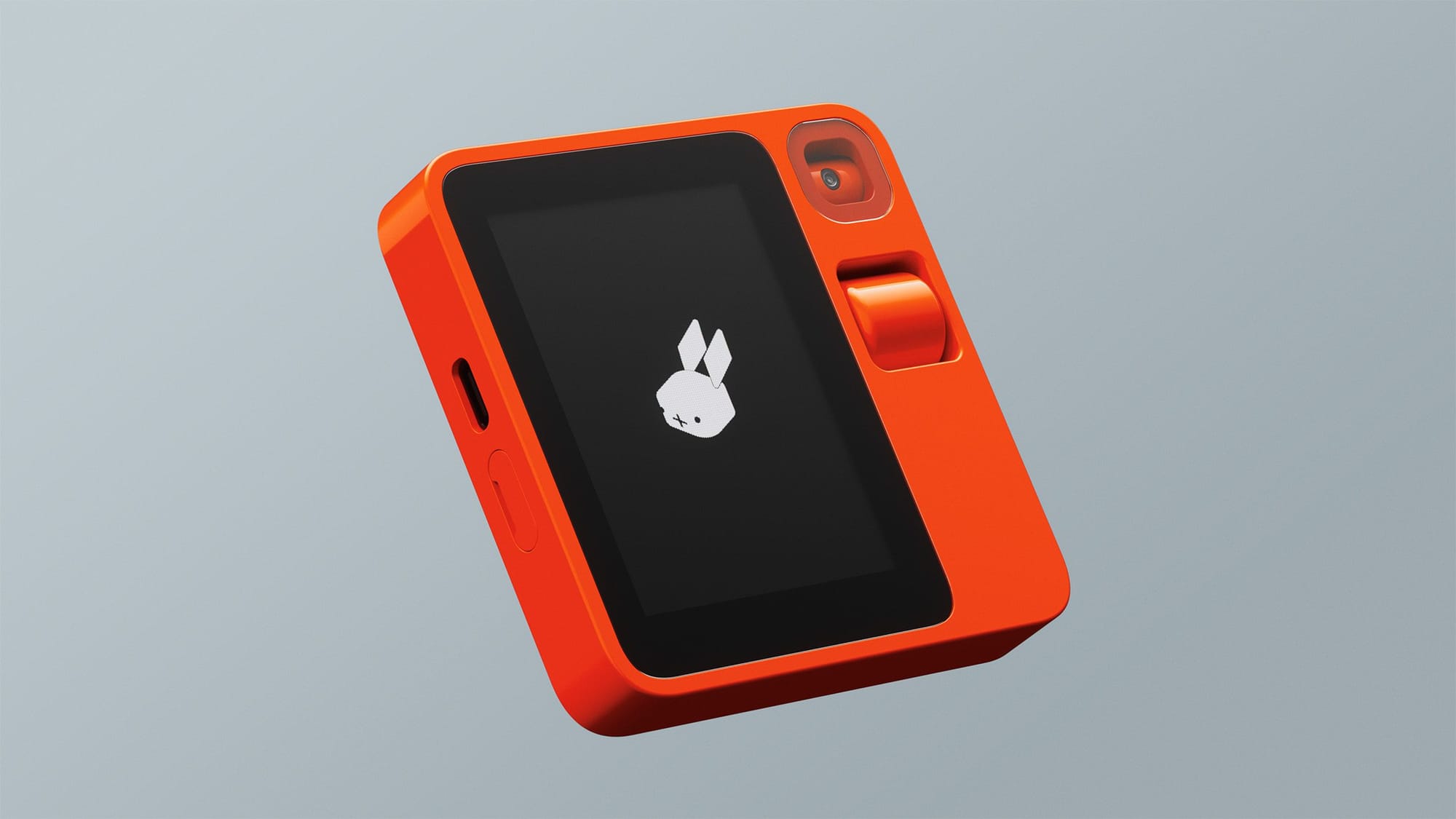
From The Verge’s The Rabbit R1 is an AI-powered gadget that can use your apps for you back in January, before anyone could try the device:
Rather than build a bunch of APIs and try to convince developers to support the R1, though, Rabbit trained its model on how to use existing apps for itself. The large action model, or LAM, was trained by humans interacting with apps like Spotify and Uber, essentially showing the model how they work. The LAM learned what a Settings icon looked like, how to know when an order was confirmed, and where the search menus are. All that, Lyu says, can be applied to any app anywhere.
So, it browses the web for you, interacts with apps for you and… delivers it onto this tiny screen with just words.
What’s the point? Again – this is a worse experience. Product designers exist to create apps that humans interact with. I don’t get why you’d want a smartphone-like device to mediate this interaction, and then tell you in text what it did with the app.
Take Uber as an example – I’d much rather see where my Uber is on a map, with due date that updates live in realtime, with some information about my driver and where I’m going. That’s a much better use of modern multitouch screen, surely?
(If you read that article, by the way, The Verge was very excited. It was a different story a few months later when they got hands on with the device).
Beyond the text box
I think we’re living in a chatbot bubble at the moment, where companies are throwing ChatGPT-like experiences into just about anything. Meta’s doing it in Messenger and Snap’s doing it in Snapchat. This is where so many think the future of AI will be. In chatting.
But these experiences are long and cumbersome and hard to digest quickly. Large Language Models just… absolutely love to chat. You ask a simple question, and before long you have War and Peace. But sometimes you just want to look at the weather. An image of a sun. Or a cloud. A chart that shows me what the temperature will do throughout the day. Not a text summary in black and white on a screen capable of more.
I think we need to redress the technologist/design balance a little – to be more integrated into everyday experiences and less about being a chatbot you can do things with. Less text-box-with-chat-bubbles and more contextual in showing you things you’ve asked for visually.
I think we’re in our pre-iPhone moment for AI. Before the iPhone, phone makers were throwing around mobile technology without putting much thought into how the user feels, what they need to do, how they might best interact with the product. AI feels like that now – we’re using the technology more and more and more, but it’s just… walls of text that I can’t be bothered to read all the way through.
But there will be a better way. Mulitmodal AI that let’s you tap or talk or – yes – type, that gives you images or animations or video or voice as you interact with it, must come soon.
Designers and product marketers and product managers and user researchers must find the thing that AI does for people. They must work with their technologist friends on genuine use cases for real people.
And design them beautifully, intuitively, like the tap of an iPhone app icon or the scroll of a social feed.